HOW WINDSURF REIMAGINED ITS BRAND: A DEEP DIVE INTO AI, DESIGN, AND ATHLETIC AESTHETICS
In an era increasingly dominated by artificial intelligence, technology companies often struggle to carve out a unique identity that transcends the typical, often sterile, tech aesthetic. Many fall into the trap of generic, grayscale branding, failing to capture the imagination or emotional connection of their target audience. Yet, a recent and remarkable transformation by Windsurf, formerly known as Codeium, demonstrates a powerful departure from this norm. Following a reported $3 billion acquisition by OpenAI, Windsurf has unveiled a new visual identity, meticulously crafted by the Vancouver design agency Metalab, that deliberately breaks every established rule of tech branding, positioning itself as something more akin to athletic gear than enterprise software. This bold move is not merely a cosmetic change but a strategic repositioning in the burgeoning AI landscape, aiming to make technology feel more human and aspirational.
THE CHALLENGE: BREAKING THE TECH MOLD
Windsurf’s journey to a fresh identity began from a recognition of limitations within its previous brand. As Codeium, the company operated with a visual identity characterized by a black background and stark teal accents. While functional, this design proved to be restrictive, particularly as the company’s product offerings expanded beyond basic code generation. The prevailing aesthetic in the technology sector often leans towards a minimalist, almost utilitarian, design language that prioritizes function over form, frequently resulting in what Allison Butula, marketing director at Metalab, describes as a “very grayscale, kind of boring treatment.” This conventional approach, while safe, can make it challenging for companies to stand out in a rapidly saturating market. For Windsurf, whose tools are designed to facilitate “seamless AI collaboration” for over a million software engineers, the objective was not just to accelerate coding workflows but to foster a deeper, more intuitive connection between human creativity and machine intelligence. The old branding, with its cold, digital feel, was at odds with this evolving vision. When machines appear to be taking over our world, a brand that intentionally makes technology feel more human, more accessible, and even inspiring, becomes a significant competitive advantage.
METALAB’S VISION: UNLOCKING UNLIMITED POTENTIAL
The strategic shift to a more human-centric and visually dynamic brand was entrusted to Metalab, a design agency with a proven track record of transforming highly technical products into emotionally resonant brands, notably their work with Slack. Metalab’s approach for Windsurf was anchored in a profound emotional concept: the idea of unlimited potential. Jordan Darbishire, brand director at Metalab, articulated this vision as being “all about flow state,” where the user is empowered to perform their best work, and the tool itself becomes an enabler of precious time. This philosophy aimed to evoke a sense of boundless possibility and fluid productivity, moving beyond the mere utility of an AI tool to encompass an entire experience of effortless creation. The redesign coincided perfectly with Windsurf’s internal evolution. The company had already launched the Windsurf Editor in November, a product that quickly gained significant traction, leading users to identify the company by its product name rather than its corporate moniker. This organic shift culminated in the official renaming of the company to Windsurf in April, making the branding overhaul a natural and timely progression. As Anshul Ramachandran, head of product and strategy at Windsurf, recounted, the early reception within the company was telling: “Probably one of my favorite moments was when we showed other people at the company the brand book for the first time and I heard the audible ‘wows’ and ‘ahs.’ If you can get a bunch of engineers in a room to do that about colors and lines, you probably did something that works.” This internal enthusiasm underscored the design’s success in resonating even with a highly technical audience.
THE ICONIC WINDSURF LOGOMARK AND TYPOGRAPHY
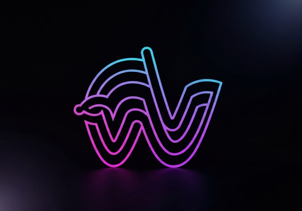
The centerpiece of Windsurf’s new identity is its distinctive logomark—a stylized “W” that ingeniously evokes the imagery of waves in motion. This flat white mark is characterized by its smooth thickness variations, imbuing it with a surprising hand-drawn quality while maintaining an underlying precision that hints at an engineer’s meticulous calligraphy on a blueprint. It’s a delicate balance of organic fluidity and structured exactitude. The logomark’s visual rhythm is further enhanced by its variable width typography, specifically using the typeface Tomato Grotesk. As the “W” letterform subtly grows wider, then thinner, then wider again, it creates a visual cadence that powerfully transmits a “flow state,” as described by Yash Mittal, lead designer at Windsurf. This dynamic interplay between the logomark and wordmark is not coincidental; the gentle curves and delicate thin ligatures of the brand’s typeface are literally echoed in the logomark’s “W,” reinforcing the sense of repetition, energy, and movement central to the “flow” concept. This design choice stands in stark contrast to the rigid, often blocky, typefaces prevalent in tech branding, instantly setting Windsurf apart. The new identity successfully merges the natural and the technical, a core tenet of Metalab’s design philosophy for this project.
COLOR PALETTE AND GRADIENTS: A SPLASH OF NEON INNOVATION
Beyond the captivating logomark, Windsurf’s brand system is enriched by a vibrant and unconventional color palette, directly inspired by actual windsurfing sails. These sails are known for their bright, neon hues, designed for maximum visibility on the water. This inspiration translates into a distinctive “design language of that sport,” as Darbishire noted, making the brand look “like it could be a windsurf, like a windsurfing athletic company.” This deliberate choice to lean into a sporty aesthetic is a radical departure from the tech industry’s muted tones. To further enhance this aquatic, flowing theme, Metalab developed a comprehensive gradient system. These pretty gradients, featuring dotted line language and dash patterns, are not merely decorative but serve as versatile building blocks that Windsurf’s designers can utilize to construct new shapes and applications across various brand touchpoints. This modularity ensures consistency while allowing for creative flexibility. The design process involved extensive exploration, moving through options that felt too fashion-forward, too overtly technical, or excessively vibrant, before settling on the optimal balance. As Mittal explains, the team “arrived at the sweet spot where we were very creative and expressive, but also we communicated our product values extremely clearly.” These dynamic gradients and striking colors are envisioned to permeate the entire user experience (UX), making interactions with Windsurf’s AI tools visually engaging and intuitively navigable.
FROM CODEIUM TO WINDSURF: A STRATEGIC EVOLUTION
The decision to rebrand from Codeium to Windsurf was a pivotal moment, signaling not just a new visual identity but a fundamental shift in the company’s market positioning and self-perception. This transformation was deeply intertwined with the successful launch of the Windsurf Editor, a product that resonated so strongly with users that they instinctively began referring to the company by its product name. This organic adoption underscored the power of the “Windsurf” identity, demonstrating its intuitive appeal and strong brand recognition among its core audience of engineers. The official renaming in April, therefore, was less a forced change and more a natural culmination of market feedback and internal alignment. It represents a strategic evolution, allowing the company to fully embrace an identity that felt more aligned with its expanded vision and the collaborative, fluid nature of its AI tools. The new name and brand serve as a direct communication to its users: Windsurf is about enabling a smooth, powerful, and almost effortless experience, much like riding a perfect wave.
THE BOLD RISK: WHY IT PAID OFF
Taking such a significant creative risk in a highly competitive market requires courage and conviction. Yash Mittal, Windsurf’s lead designer, openly admitted the team’s willingness to embrace failure rather than settling for mediocrity: “At the end of this process, where do we want to be? And we’re like, we want to take this big risk. And even if it fails, we’re okay with that because we don’t want to end up with a brand that looks just like any other tech brand.” This mindset—a refusal to conform to prevailing industry aesthetics—was fundamental to the success of the rebrand. Metalab’s expertise in translating technical functionalities into emotionally compelling narratives was critical. Their work for Slack, another highly technical product transformed into a beloved brand, provided a blueprint for Windsurf. The internal reception, marked by engineers’ “wows” and “ahs” over color palettes, was an early indicator of success. Moreover, the market reception has been overwhelmingly positive. Ramachandran noted that customer feedback, particularly from enterprise clients, has validated the new direction: “Almost all of our customers, especially on the enterprise side, they’re like, okay, yeah, that’s great. You see the W, I see the wave, I see the flow. It makes a lot of sense.” This immediate understanding and appreciation of the brand’s core message—flow, potential, and ease—demonstrates the power of a well-executed, distinctive brand strategy.
BRANDING IN THE AI GOLD RUSH: A NEW DIFFERENTIATOR
The current landscape of the technology industry, particularly within artificial intelligence, is often described as a “gold rush.” As countless AI companies emerge, vying for attention and investment, the challenge of differentiation becomes paramount. Luke Des Cotes, CEO of Metalab, observes this phenomenon firsthand: “There is going to be like this real renaissance of value put towards brand as being a core differentiator.” In an environment where functionalities can often be replicated, a unique and memorable brand identity becomes an invaluable asset, transcending mere product features to create a lasting impression and foster loyalty. Windsurf’s rebrand is a prime example of this strategic foresight. By adopting an aesthetic that feels fresh, human, and even sporty, it distinguishes itself from the myriad of AI solutions that adhere to more conventional, predictable design codes. This bold move positions Windsurf not just as another AI tool, but as a lifestyle brand for developers, suggesting a dynamic, invigorating experience rather than a purely functional utility. This approach redefines what an AI company can look like and how it can connect with its audience, signaling a shift in the broader tech industry towards more emotive and experiential branding. The official rollout of the complete rebranding across all Windsurf materials and its website, strategically timed for just before International Surf Day, further amplifies this unique identity, solidifying its place as a leader not just in AI development, but in brand innovation.
CONCLUSION: SAILING TOWARDS THE FUTURE OF AI DESIGN
Windsurf’s transformation stands as a powerful testament to the impact of strategic, daring design in an increasingly crowded technological landscape. By moving beyond the conventional, often uninspired, aesthetics of the tech industry, Windsurf and Metalab have crafted a brand that is not only visually striking but deeply resonant with its core audience. The new identity, with its flowing logomark, vibrant color palette, and a narrative built around “unlimited potential” and “flow state,” redefines what an AI coding brand can be. It demonstrates that even the most technical products can benefit from a human-centered design approach, fostering emotional connections and inspiring loyalty. In the ongoing AI gold rush, Windsurf’s rebrand serves as a potent reminder that differentiation extends far beyond functionality; it resides in the creation of a powerful, unique, and memorable brand experience. As the company continues to evolve, its new brand identity provides a robust foundation for continued innovation, sailing confidently into the future of AI and design.

